miFonda wallet

a mobile wallet for
restaurant owners

ROLE

TIME

TEAM

Designer
April 2024
Sarah Comlan,
Liam Capozza,
Kiara Vong,
Matt Murakami

miFonda, also known as Fonda Technologies, Inc., is a platform that helps Latino-owned restaurants to manage and grow their online businesses.

An Overview

miFonda wants to create a mobile app that will empower business owners with real-time insights into their finances, sales, and expenses. Instead of operating blindly and waiting for an accountant to review their finances, our goal is to provide them with immediate visibility and control over their financial data.

Project Brief

After speaking to the founder, we identified features that should be implemented in the app.

App Features

Real-Time Balance and Transaction
Overview
Statement Management
Payee Management
Seamless Money Transfers
Detailed Account Information
User-Friendly Interface
Security and Compliance

Sketches

Kiara Vong

With my sketches, I went for a very clean look while using many icons to make the app visually easy to navigate. In both my workflows, my home screen has the balance of the account and a list of recent transactions for when restaurant owners wants a quick glimpse into their account. There's also a navigation menu at the bottom to click on quick actions. There's an option to click to see a full list of transactions and graphs to display balance analysis. I leaned towards rounded edges and icons for a more welcoming and appealing vibe.

Sarah Comlan

When designing my sketches, I focused on the original view of the miFonda Wallet app that was provided by the founder and tried to think of different ways to display the most information but still be mindful of the real estate of the screen. I thought about the different scenarios that restaurant owners may come across and created different views for scenarios like accounts, a clear view of the balance, and overall transaction history.

Liam Capozza

For my sketches I wanted to have four screens. One for the login, one for the home/dashboard, one for the transactions and one for user info. My first flow incorporated more elements from their original site while my second flow felt more like an app. During my sketches, it became apparent to me that the second flow felt right and was better for seeing and understanding information quickly and on the go. It applied more mobile practices and was the flow I ultimately pulled the most from throughout the project.

Matthew Murakami

When creating the initial sketches for the Mi Fonda Wallet app, my goal was to design a user interface that would make information easily accessible and viewable at a glance. This was crucial because people in the restaurant business are always busy, and quick access to information can streamline their decision-making process in day-to-day tasks. To achieve this, I aimed to create a main dashboard page displaying the user’s balance and important information below it, complemented by either a donut graph for a breakdown of income or large navigable icons to allow quick retrieval of specific information.

Components from Sketches

Wireframe
When creating the initial sketches for the miFonda Wallet app, my goal was to design a user interface that would make information easily accessible and viewable at a glance. This was crucial because people in the restaurant business are always busy, and quick access to information can streamline their decision-making process in day-to-day tasks. To achieve this, I aimed to create a main dashboard page displaying the user’s balance and important information below it, complemented by either a donut graph for a breakdown of income or large navigable icons to allow quick retrieval of specific information.

First-Iteration Wireframes

From left to right, we have the login page, home dashboard, full list of transactions, and account details. Our initial wireframes were based on our collective sketches, featuring a basic login screen similar to many apps, designed to be simple and modern. The dashboard offers an “at a glance” view of the account, displaying the balance and a donut graph for expenses. However, this design wasn't suitable for a restaurant's needs, so we later revised it. The transactions page initially featured a graph to display revenue and expenses, which we later decided would be a bar graph. The account info screen included sections for Personal, Security, and Other, with multiple buttons, designed to remain simple and functional.

Colored Wireframes

Critique & Feedback

After gathering feedback from peers and clients, we received valuable insights
Studio critique suggested improvements in visual representation by adding a bar chart for better data visualization over time, using contrasting colors and clear categories, clarifying the function of them donut chart, implementing a barrier between graph and transaction list, improving clarity on transaction grouping, and simplifying the navigation bar.

Feedback from Professor Talie highlighted the need for the app to differentiate itself through enhanced data utilization, providing comprehensive insights into business performance, seasonal trends, and customer preferences.

Second Iteration Wireframes

In our second wireframe iteration, we integrated feedback from the founders, classmates, and professors to refine our design.
• Dashboard Redesign: Responding to confusion regarding transaction categorization and    the unclear function of the donut chart, we replaced it with a prominent balance display.    Users can blur this balance for privacy. We introduced a progress bar to track budget    utilization, addressing user-defined budget concerns.
Transaction Page Refinement: Student feedback on cluttered spacing led us to add    dividers and increase white space for better section differentiation. We unified transaction    backgrounds, enhancing visual appeal per Fonda's suggestion.
Navigation Enhancement: Simplifying the navbar by removing text and improving icons   for    clearer navigation paths addressed student concerns about clutter.
Key Selling Feature Integration: Following the professor's suggestion, we redesigned the    donut chart to display income sources exclusively. Tapping on a segment filters transactions    accordingly, enhancing intuitive user interaction.
Note: Despite some students' suggestion to replace the donut with a bar chart, we deferred this change as the founder requested further exploration. We also found the donut chart more visually appealing.

Visual Style Guide

For our style guide, we didn't need to create one from scratch as Fonda provided us with their existing guide for their website. However, they noted that since they don't currently have a mobile app, we were granted some freedom in our design choices. Given that Fonda Wallet is used for a restaurant’s finances, we believe that Fonda made their design decisions so that they could convey a user’s financial information clearly without introducing content or colors that would be distracting from the user experience. When creating the mockups, we decided to stay faithful to the original style guide as it worked well with our designs and allowed us to achieve our goal of effectively showing financial information.

High-Fidelity Prototype

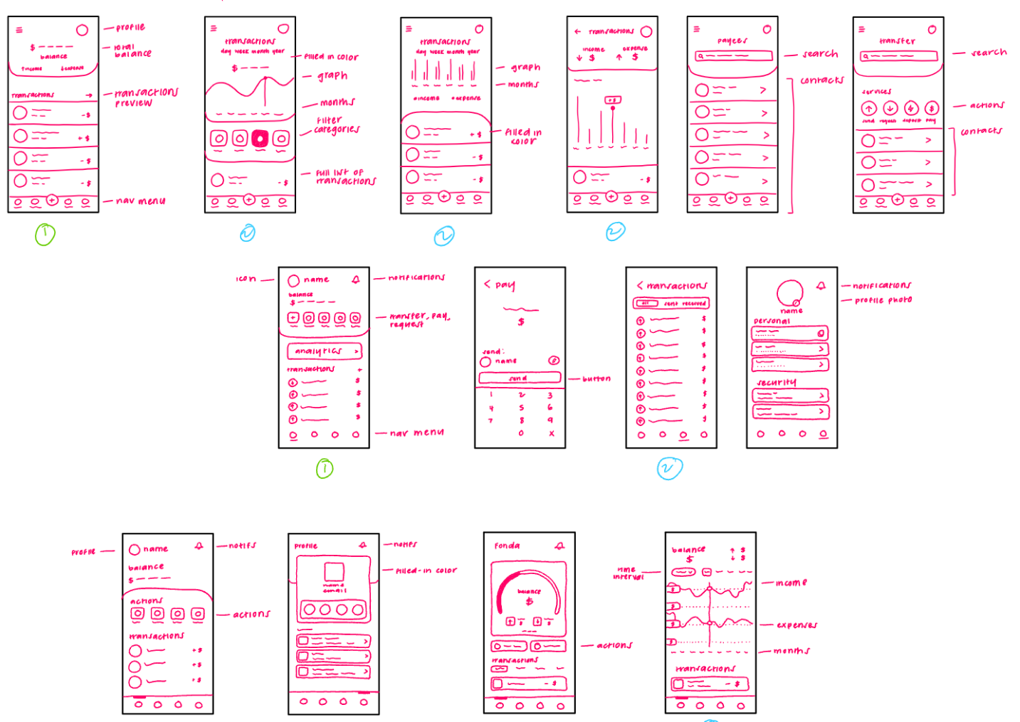
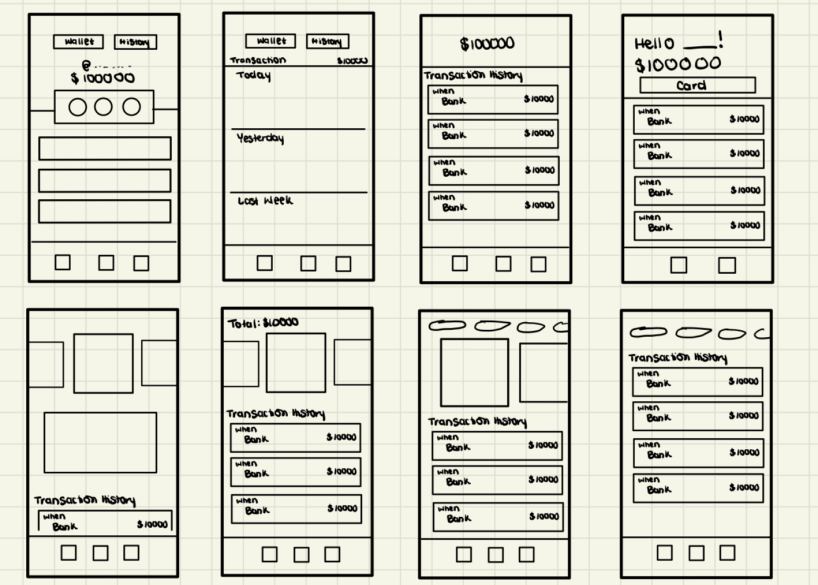
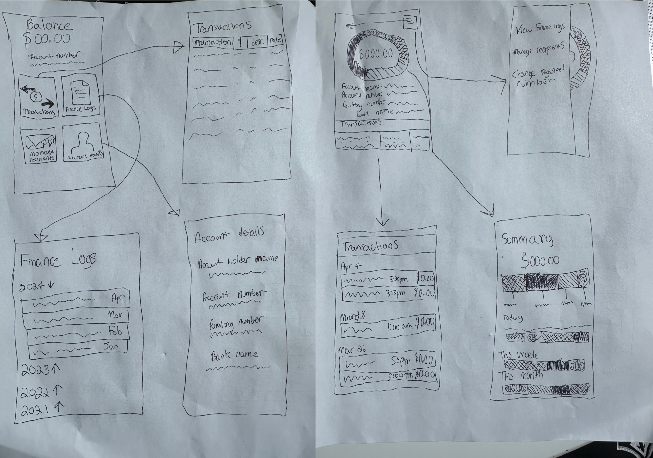
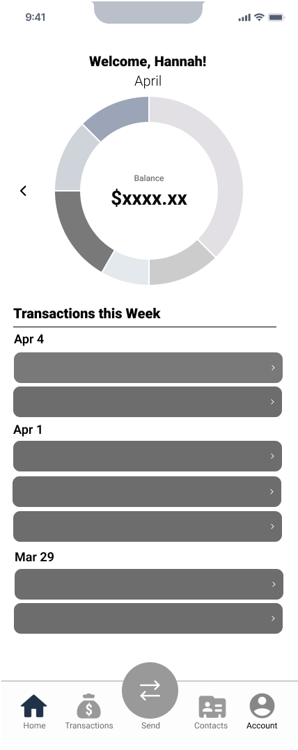
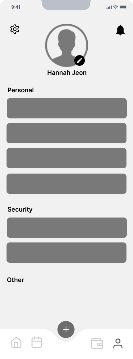
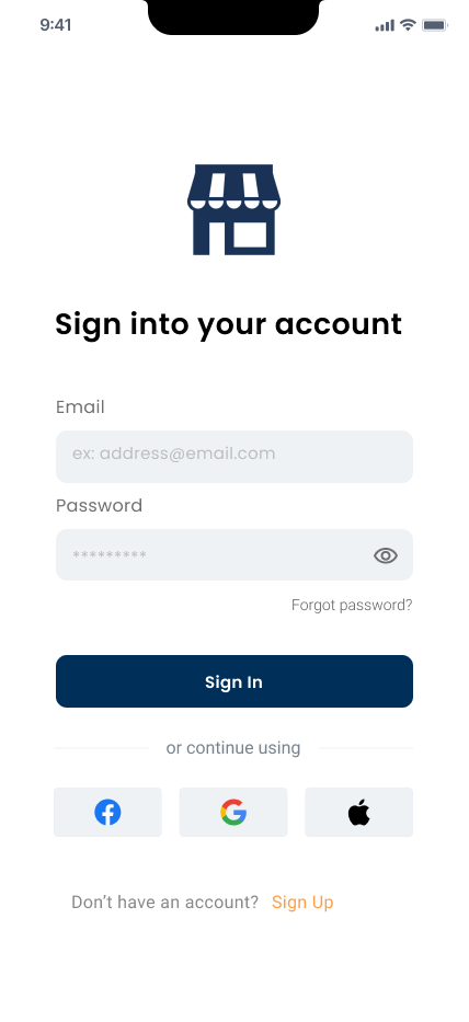
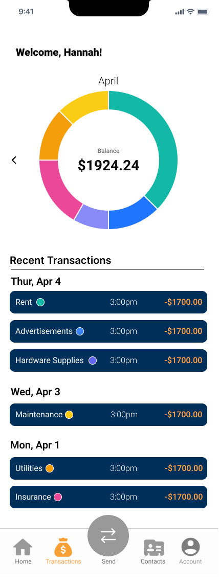
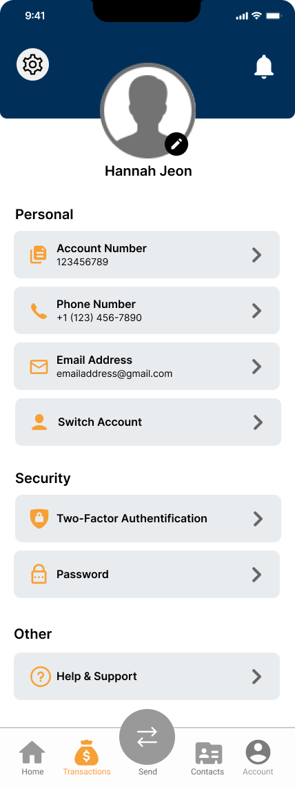
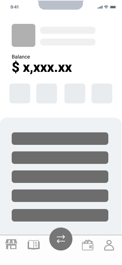
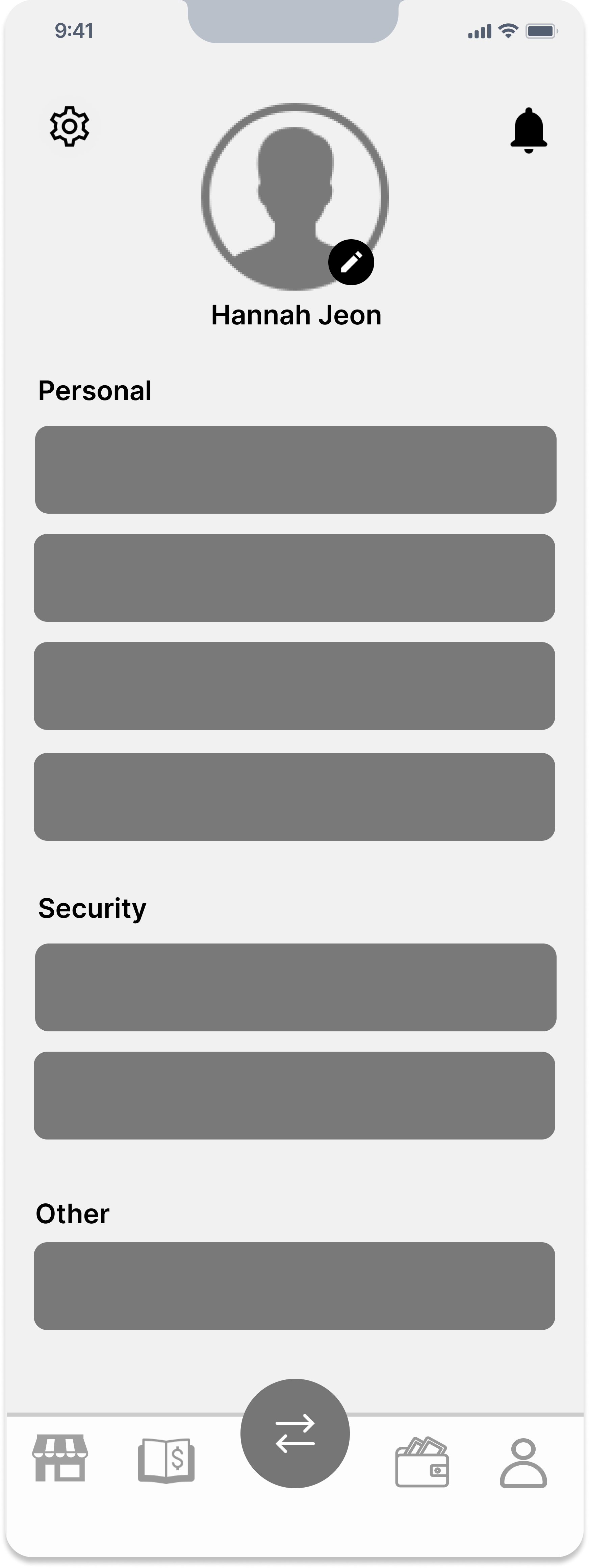
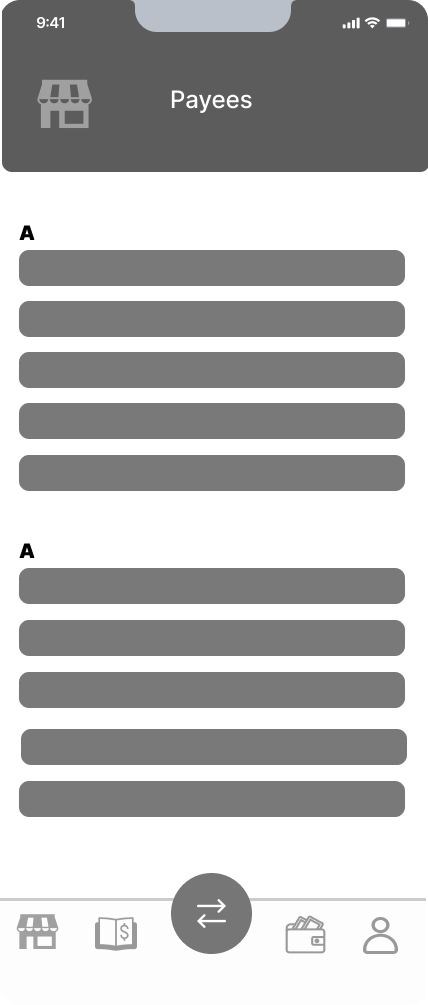
Our high fidelity prototype included several key screens: login, home dashboard, transaction, transaction details popup, payee contact book, send, confirm send, payment method popup, and account info. We used the Roboto font, per Fonda's style guide, and adjusted heading and body text sizes to highlight important elements like the dashboard balance and transaction dates. Based on feedback, we improved color contrast by changing the transaction background to light. Utilizing Figma's grid functionality, we maintained alignment, spacing, and white space to ensure a modern, uncluttered design.

Founder Feedback

During our meeting with the founder of a company developing a banking app for restaurants, we discussed the app's design and functionality. The login feature was well-received, but a sign-up option is needed. Integrating biometric verification like face recognition could enhance security and convenience. The "budget" line on the dashboard should be renamed "goal" to better communicate its purpose. Including dates in the transactions section and changing the display from monthly to weekly would help restaurant owners observe spending trends and manage budgets more effectively. A swipe-through feature for different views was suggested for easier navigation. We emphasized the need for robust analytical tools to help users gain insights into their financial patterns. Lastly, enhancing safety features in future updates is crucial to ensure the security of sensitive financial data. These adjustments could greatly improve the app’s utility for restaurant owners and managers.

Final Design